Mike and Ike Package Redesign

Design Statement:
The Mike and Ike packaging design project is meant to showcase a past designer and their work. Showcasing their work in a reimagined packaging of a current candy brand. The designer I chose was Theo Van Doesburg, a dutch artist and leader of the De Stijl artistic movement, which took place from 1917-1931. De Stijl was a Dutch variation of the geometric abstraction that is characterized by long straight black lines used to define rectangles that are used vertically and horizontally. These rectangles are restricted to primary colors (red,blue,green) alongside black, white, and gray. This artistic movement’s use of color and geometric shapes worked amazingly to compliment Mike and Ike's use of color and shape of their candy.
Inspiration from Theo Van Doesburg

First Design:
For the first draft design, I took inspiration from the artwork and wanted to integrate the artwork into the geometry of the packaging box which already is a rectangle shape. Using the side panels and front/back sides of the box to be its own simplistic color and rectangle like the artwork, while sticking to primary colors


Second Design:
For the second draft design, I took inspiration from the artwork and wanted to integrate the triangular shapes into the packaging. I took the original design and used it to create a triangular pattern along the side panels. And for the front and back side of the box, I enlarged the original design, and replaced it with colors of the pieces of candy. I removed the fruits and candy pieces that were originally displayed in the front of the packaging to provide a simplistic packaging design that relates back to the artistic movement of simplicity.

Third Design:
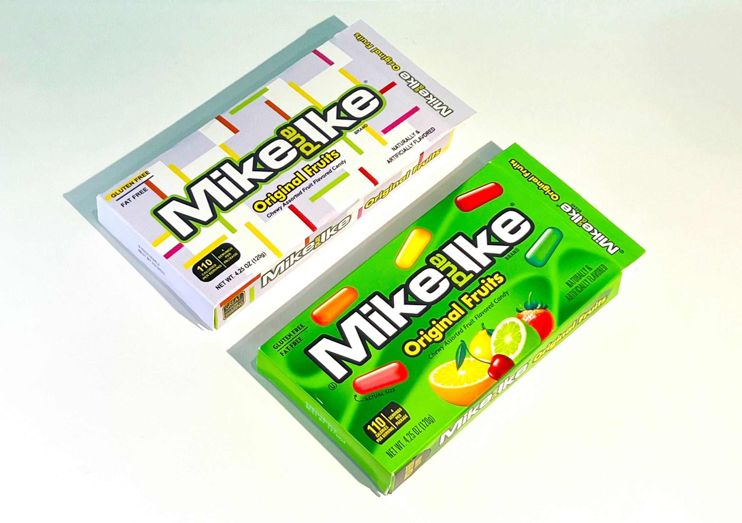
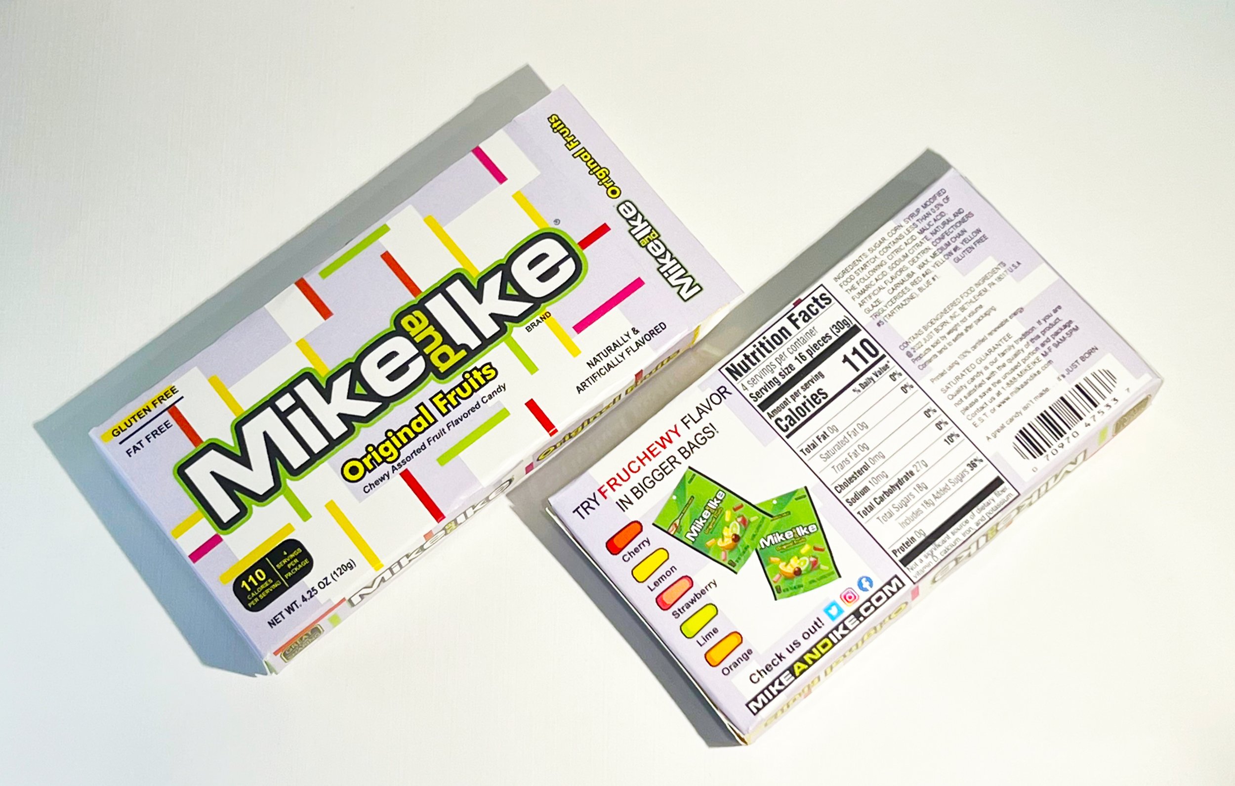
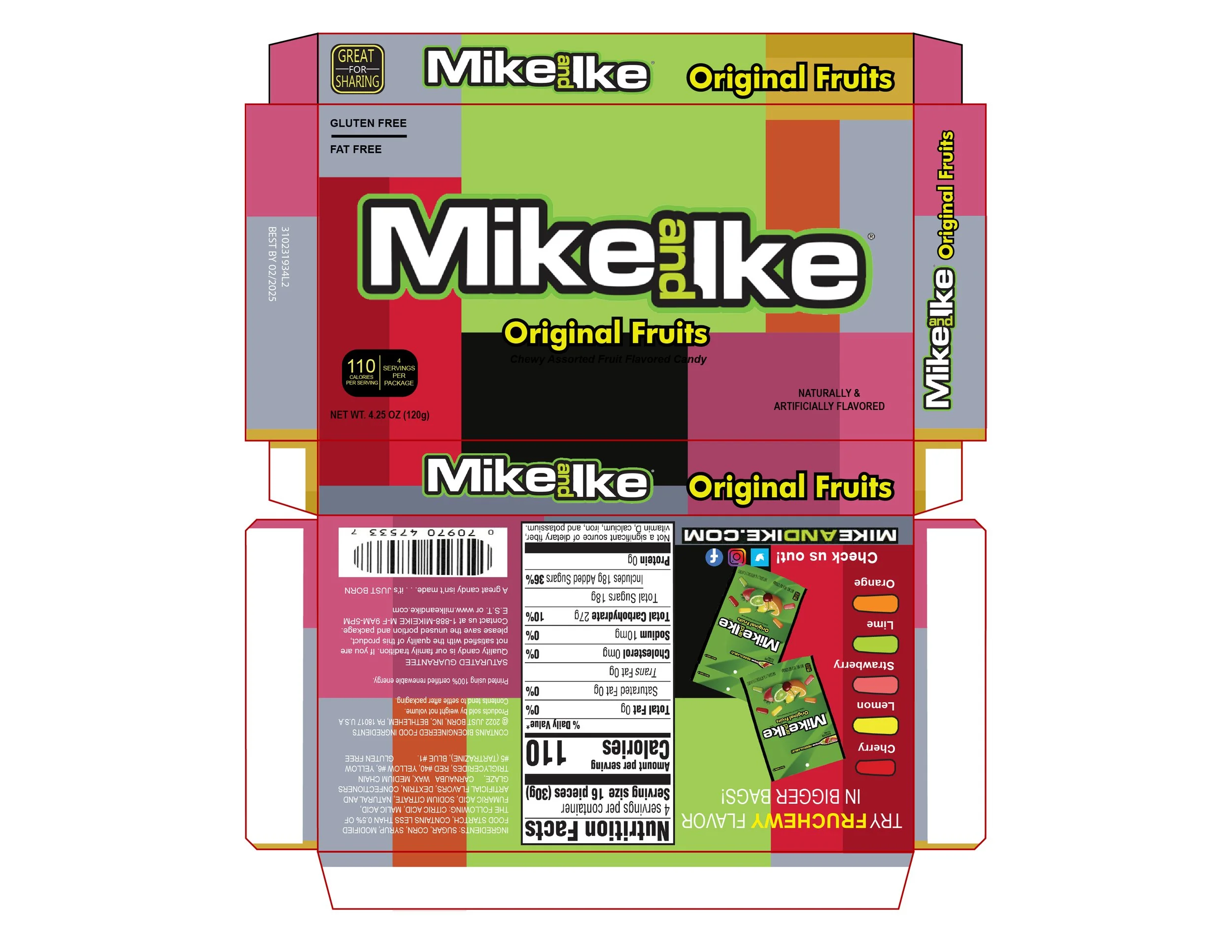
For the third draft design, I took inspiration from the artwork and wanted to integrate the square and rectangle shapes into the packaging. Each shape’s color also represents the different flavors of the candy pieces, but also integrated the use of black and grey squares to relate back to De Stijl’s use of black, white, and gray.


Fourth Design:
Mike and Ike’s packaging highlights the candy pieces, which are long, pill-shaped forms with curved edges. These shapes can be simplified into rectangles, relating back to Theo van Doesburg’s geometric style. This simplification of the pill-shaped pieces into rectangles reflects De Stijl’s emphasis on simplicity and harmony that was a direct response to the chaos in WW1.

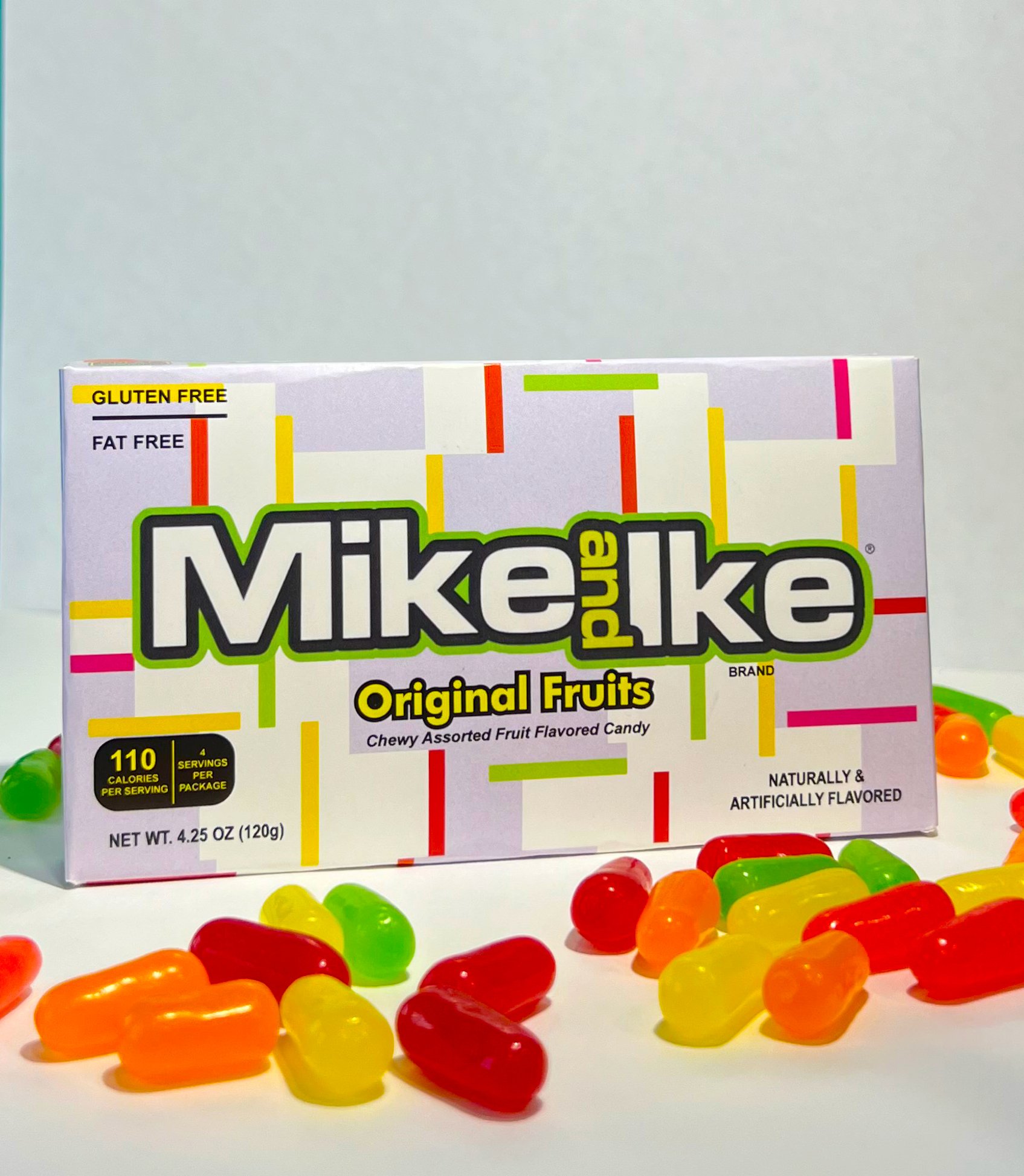
Revised Final Design
