Colgate Redesign

Design Statement:
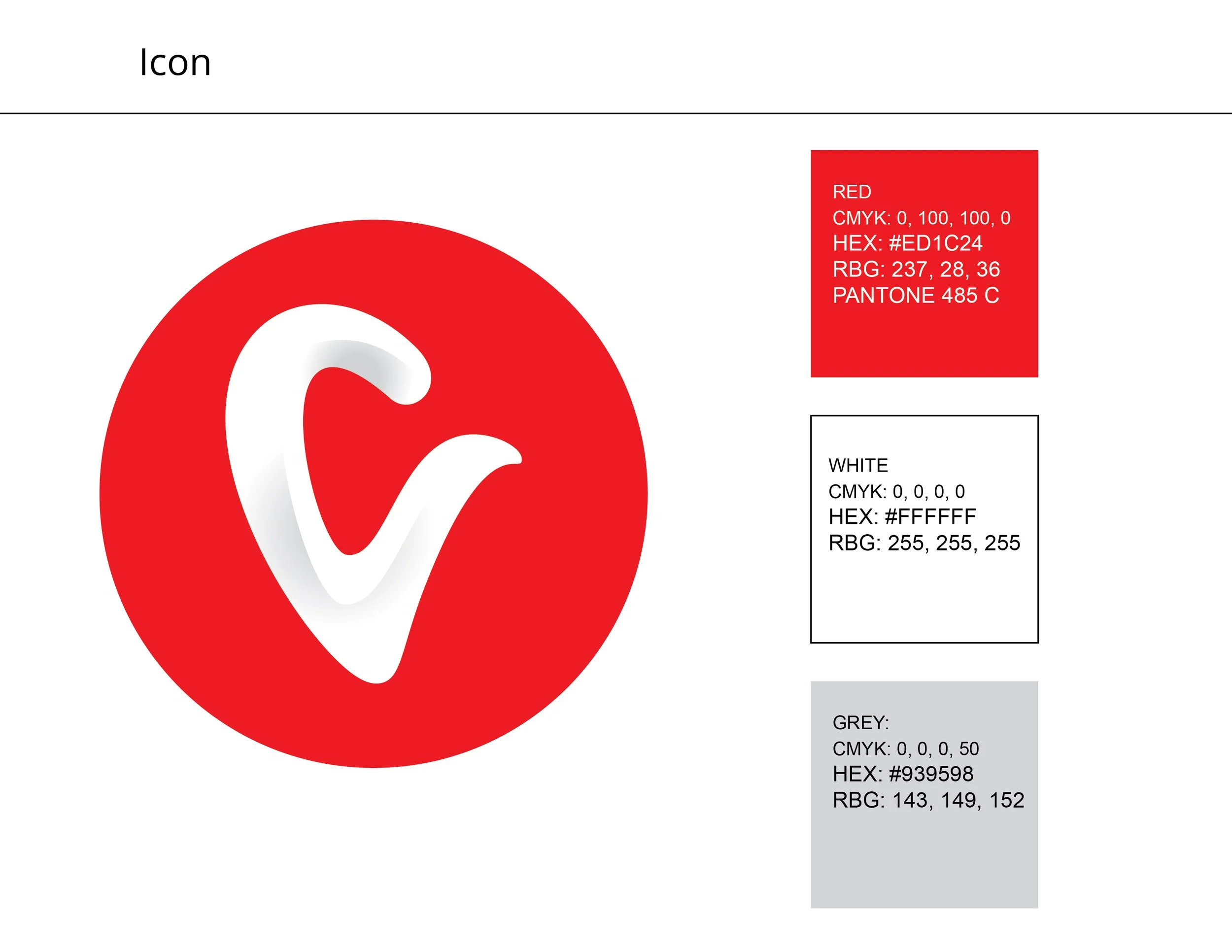
For this project, I chose a common well-known toothpaste brand to redesign being Colgate. Colgate’s logo has not changed much throughout history, so I set to challenge myself to create a new set of designs for Colgate that felt fresh, but still remained true to their identity. The final design is a letterform that combines the letter “C” and a depiction of a tooth. The rounded corners give the design a more friendly approach (relating back to the curve shaped of teeth), and the shadows give the design a modern feel that relates back to their identity.

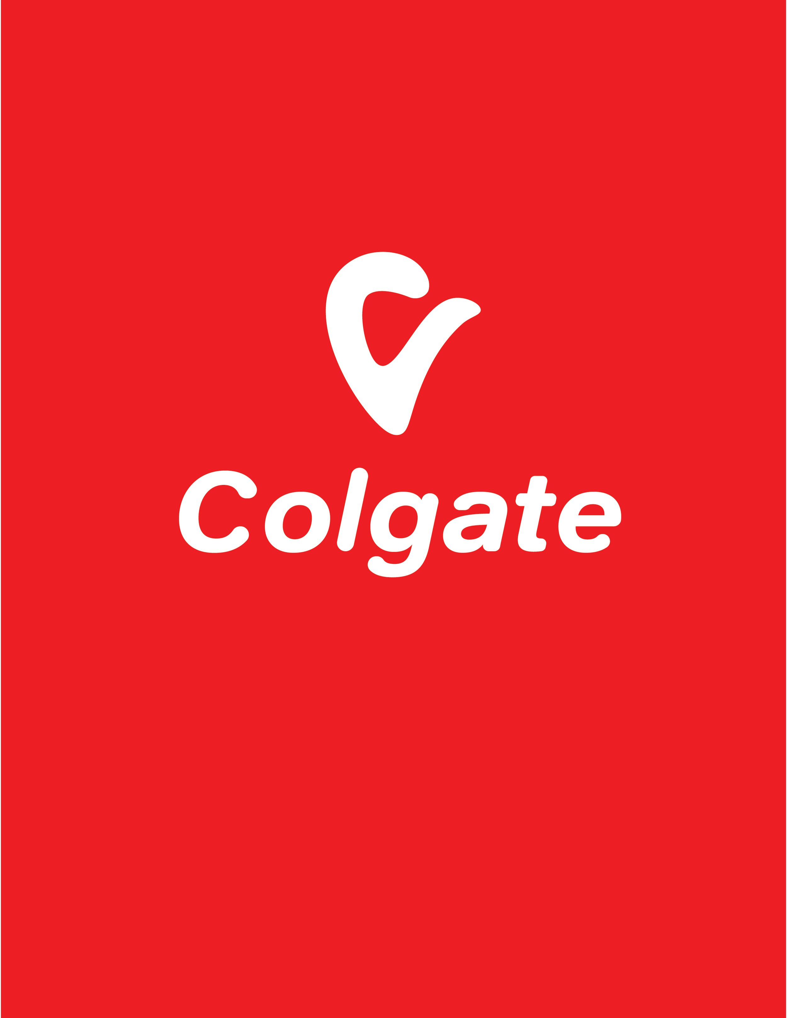
Primary Lockup

Alternate Lockup
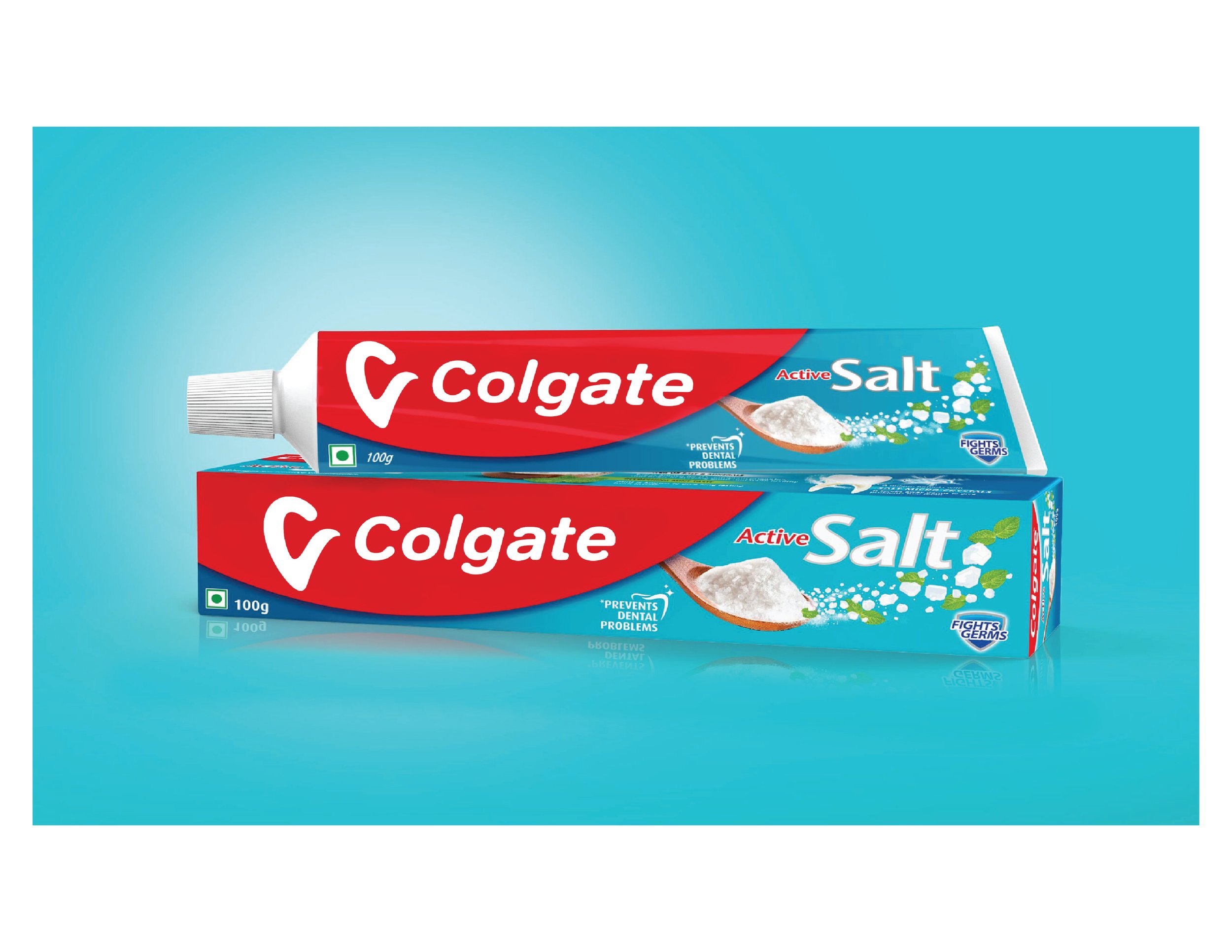
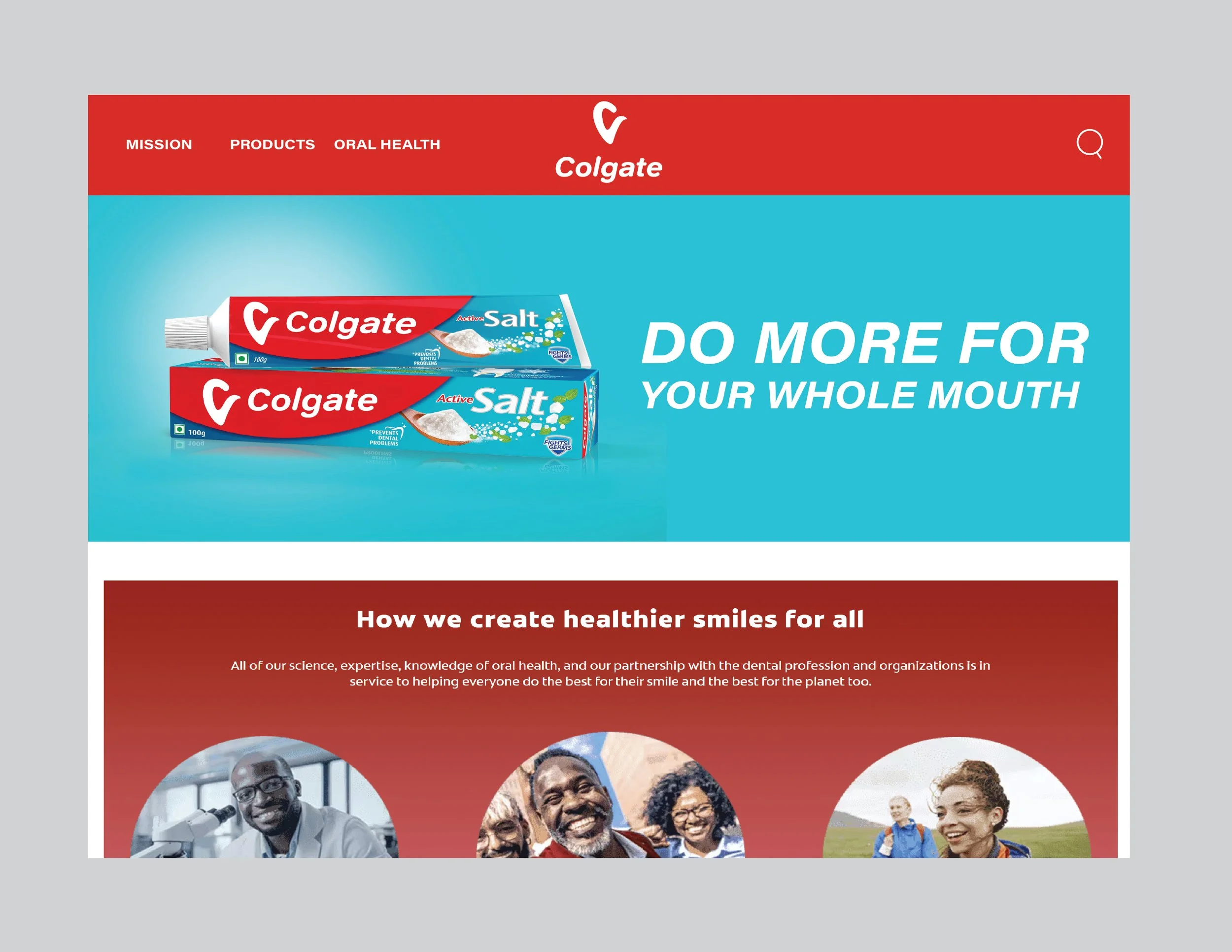
Mockups

Transport

Packaging

Website

Social Media
Process Research - Colgate History


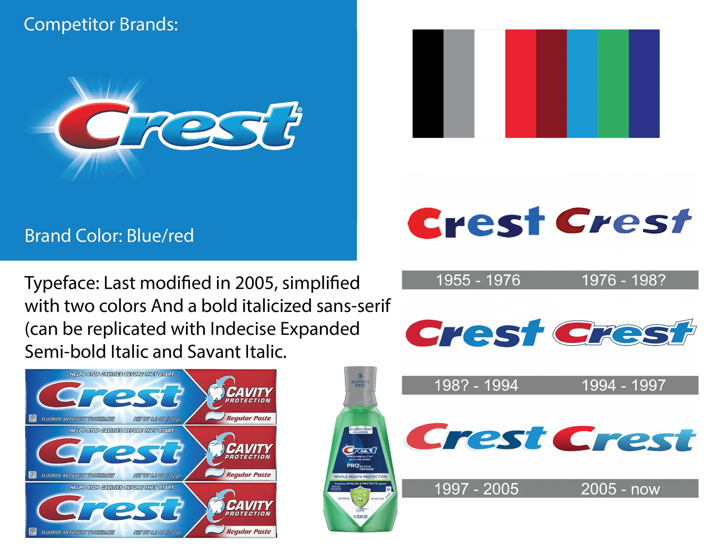


Process Research - Colgate Competitors


Process - Logo Sketches

Process - Draft 1: Six Logo Concepts

I decided to use the letter “O” to showcase a shine effect.

The gradient wordmark which was meant to represent cleaning your teeth. I added a gradient and made the top white, and the bottom red. The white was supposed to resemble the teeth being cleaned, and the red was meant to represent it was yet to be cleaned.

The third design was a pictorial mark of a tooth alongside the wordmark of Colgate.

Letterform idea that is meant to represent the letter "C" while including the negative space of a tooth. The letterform itself also looks like a tooth.
Letterform idea that played more on the idea of making it look like the letter "C" and a tooth.

Based off the smiley face element that Colgate already has. But I put the smile below the letter C and O to make it look more like a face since the letters represent the eyes.
Process - Draft 2: Three Concepts Refined


Process - Draft 3: Two Concepts Refined


Process - Final Revisions


I wanted to give the redesign a shiny/glossy look. Meant to capture the overall mission of Colgate, which is to keep your teeth healthy and clean. Adding shadows is such a small detail, but it really changed the look and feel of the rebrand design.

