
Chop-Chop Food Delivery App
Design Statement:
For this project, I needed to create a set of unique icons. These icons I would then expand into subtopics of food categories, which I created Icons for. I developed an identity of the brand based off the negative spacing within the icons.
I created the name of the app based off the icons, along with an app prototype to demonstrate the UI and transitions. The goal was to successful create an app that would allow me to order a Whopper Meal from Burger King.


Video and Icons
Process - Icons

First Round Draft of Icons.


First Round Draft - Expanding on One Icon Design - Adding Three New Icons.


Second Round Draft Refinement - I refined the dashes/chops within the icons, giving the icons a thicker stroke to be more visible. I curved out the edges to give a softer approach to the customer/viewer, and also relates back to the curves found within foods. Overall, giving it a more friendly and softer approach.

Final Icons - I refined the icons by the amount of detail I included within the icon. Some icons had more details than others like the donut and pizza compared to the strawberry and fish. This final set of refinement was to simplify the unnecessary details. If more detail is applied to one icon, there would have to be more added detail to the rest to create a cohesive set. But with too much detail can cause scalable issues. I knew in the app prototype, I was going to add context/label the icons, which allowed me to remove the unnecessary detail to make it fit the rest. Making the set of icons easy to read and fast to understand.
Process - Logo

Word Exercise - List of words relating to my chosen category (food delivery).

List of words relating to my chosen icon designs, and creating list of possible brand names from this exercise.

Type Exploration - Selecting 20 typefaces that fit the brand and icon designs, and refining/editing those typefaces.

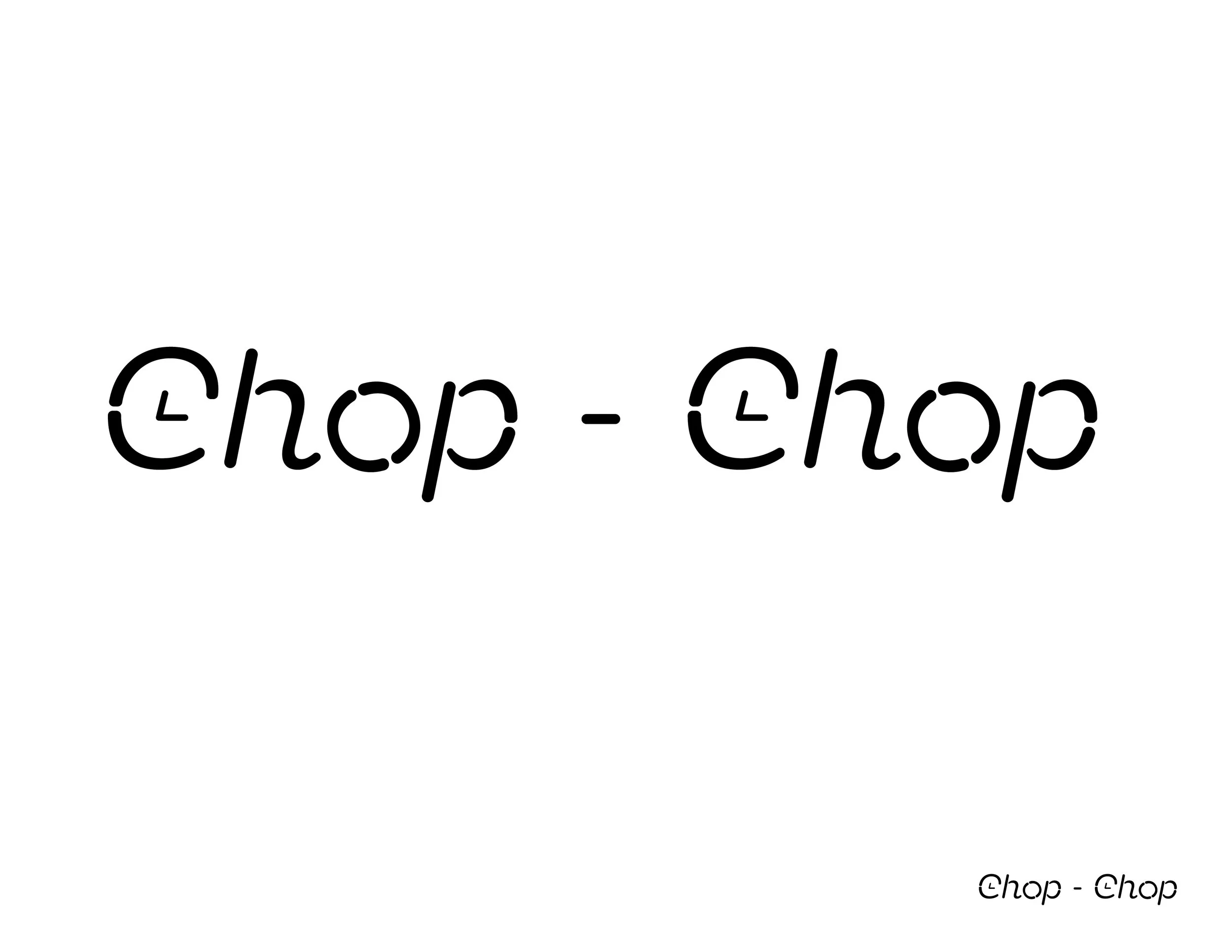
Selected the top 5 typeface designs. Chosen typeface was Neighbor Stencil Light Italic. The typeface reflected the chopped/dashed line design of the icons, especially when I rounded the corners to give it a softer approach. The "C" worked as the face of a clock meant to demonstrate the speed food would be delivered with this brand. Relating back to the brand name.

First Round Draft - Primary
First Round Draft - Secondary

Second Round Draft (incorporation of color) - Color is important when creating a brand. You have to think about how it affects people, if people like that color, and incorporate it well with your brand idea. Just choosing any color won’t help all the time. There has to be an association of why that color was chosen. I made drafts with the word mark with many colors, but orange stuck out the most. When people think of urgency or speed, those warm colors are the first to come out. And orange made the font overall pop out more, complimenting the font well.


Final Revisions - While editing the logo, the lines within the letter C that represents the clock appeared thinner than the typeface. I made the lines match the thickness of the type to make it more cohesive with the typeface. The hyphen also seemed to be too separated from the logo, so I brought the hyphen closer to unite the logo all together. The app icon in the bottom left would be used for the app prototype. The app icon uses the lettermark from the main logo to maintain brand consistency. Final versions are shown in black and white to showcase that the brand logos are strong without the use of color.
Process - Wireframe Sketches


The wireframe sketches showcase how each page of the app would look like. From the initial loading screen, top categories page, fast foods page, Burger King menu, and checkout page.