Bazooka Gum Redesign

Design Statement:
For this project, I chose a common well-known toothpaste brand to redesign being Colgate. Colgate’s logo has not changed much throughout history, so I set to challenge myself to create a new set of designs for Colgate that felt fresh, but still remained true to their identity. The final design is a letterform that combines the letter “C” and a depiction of a tooth. The rounded corners give the design a more friendly approach (relating back to the curve shaped of teeth), and the shadows give the design a modern feel that relates back to their identity.


Process Research - Creative Brief
Process - Inspiration
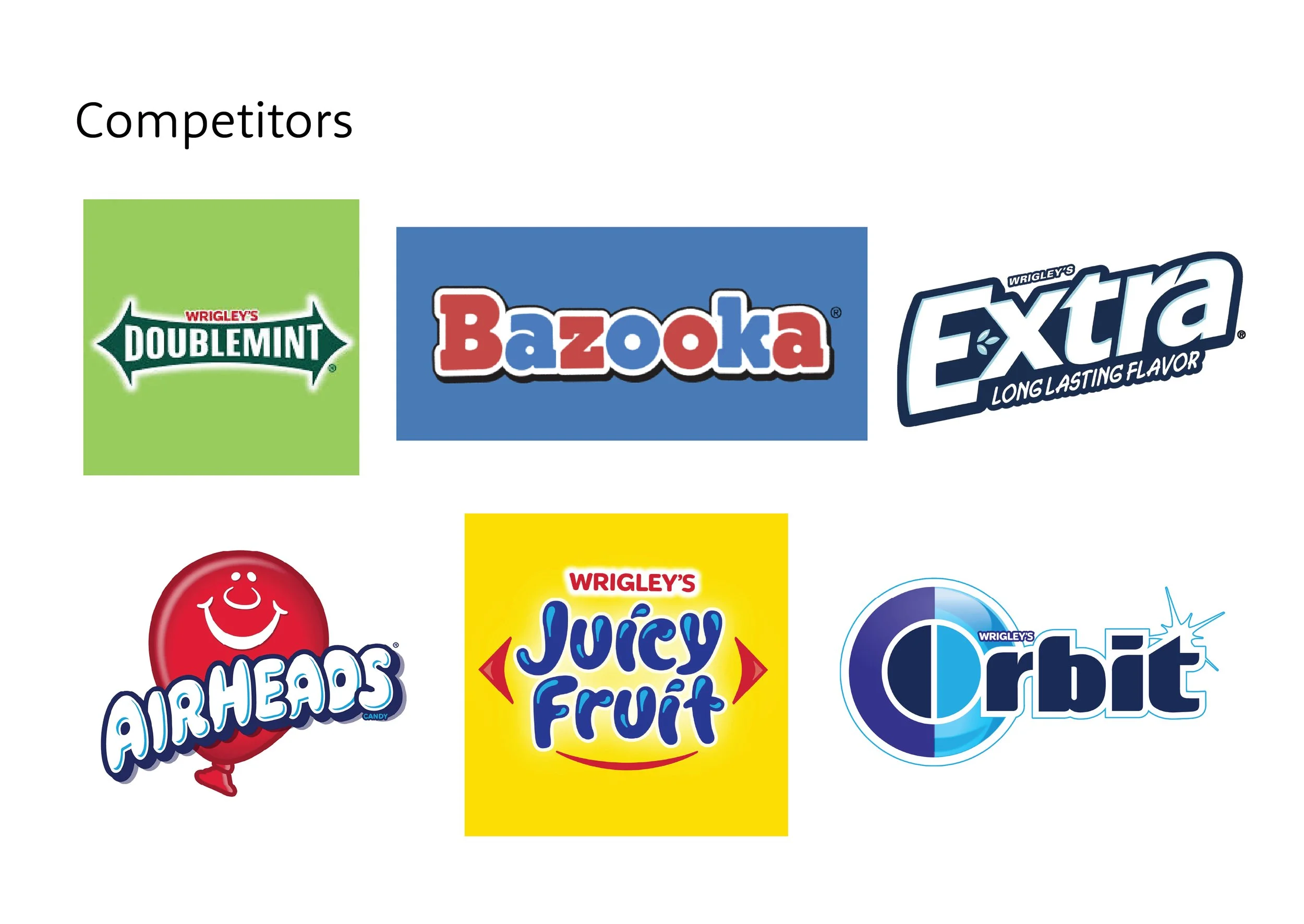
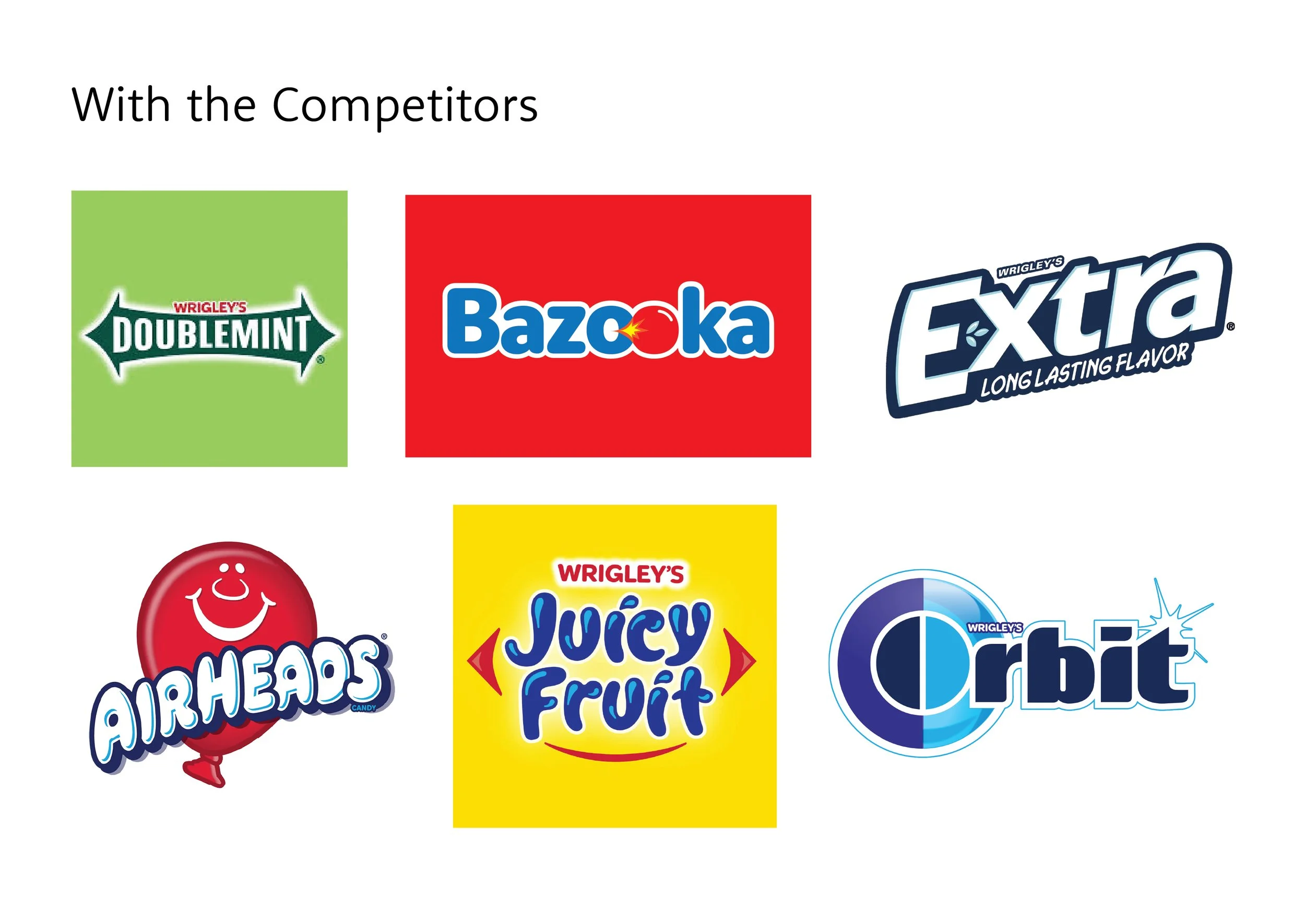
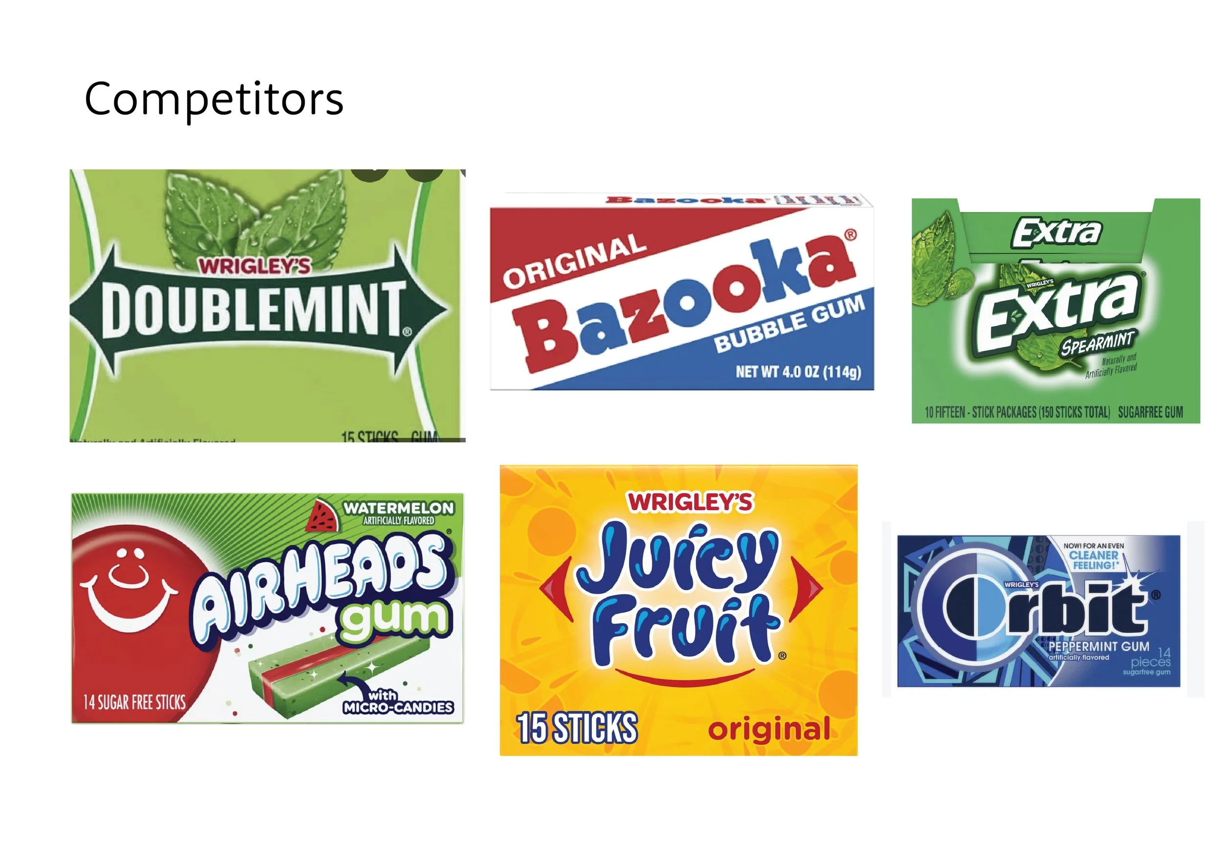
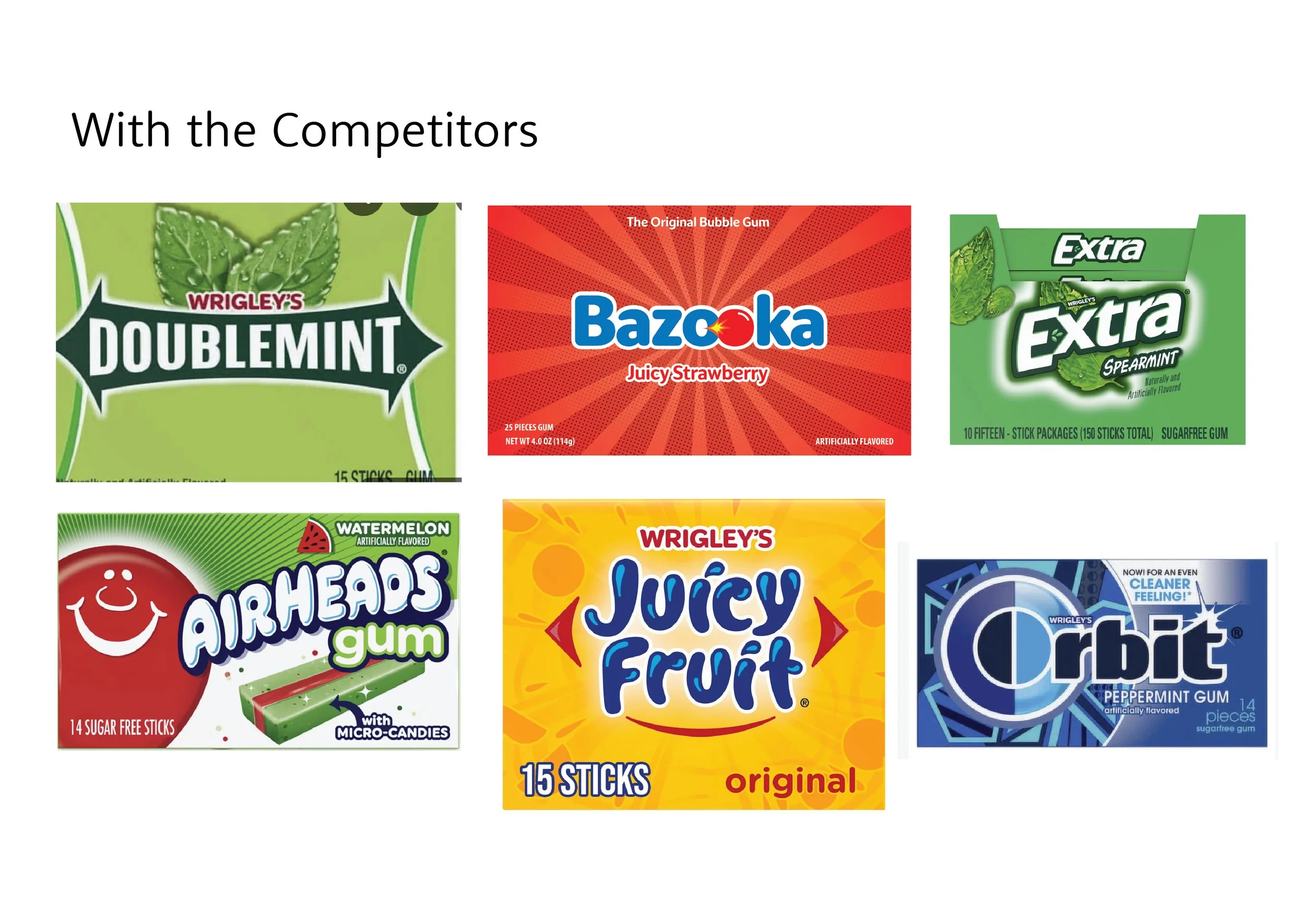
I chose the brand called Bazooka, which is a gum brand, and I chose this because the name itself gave me inspiration of what this brand could be. The name also sparked ideas of what this brand could do with their packaging instead of just the three stripped colors that’s currently on the box.
Process - Logo Sketches
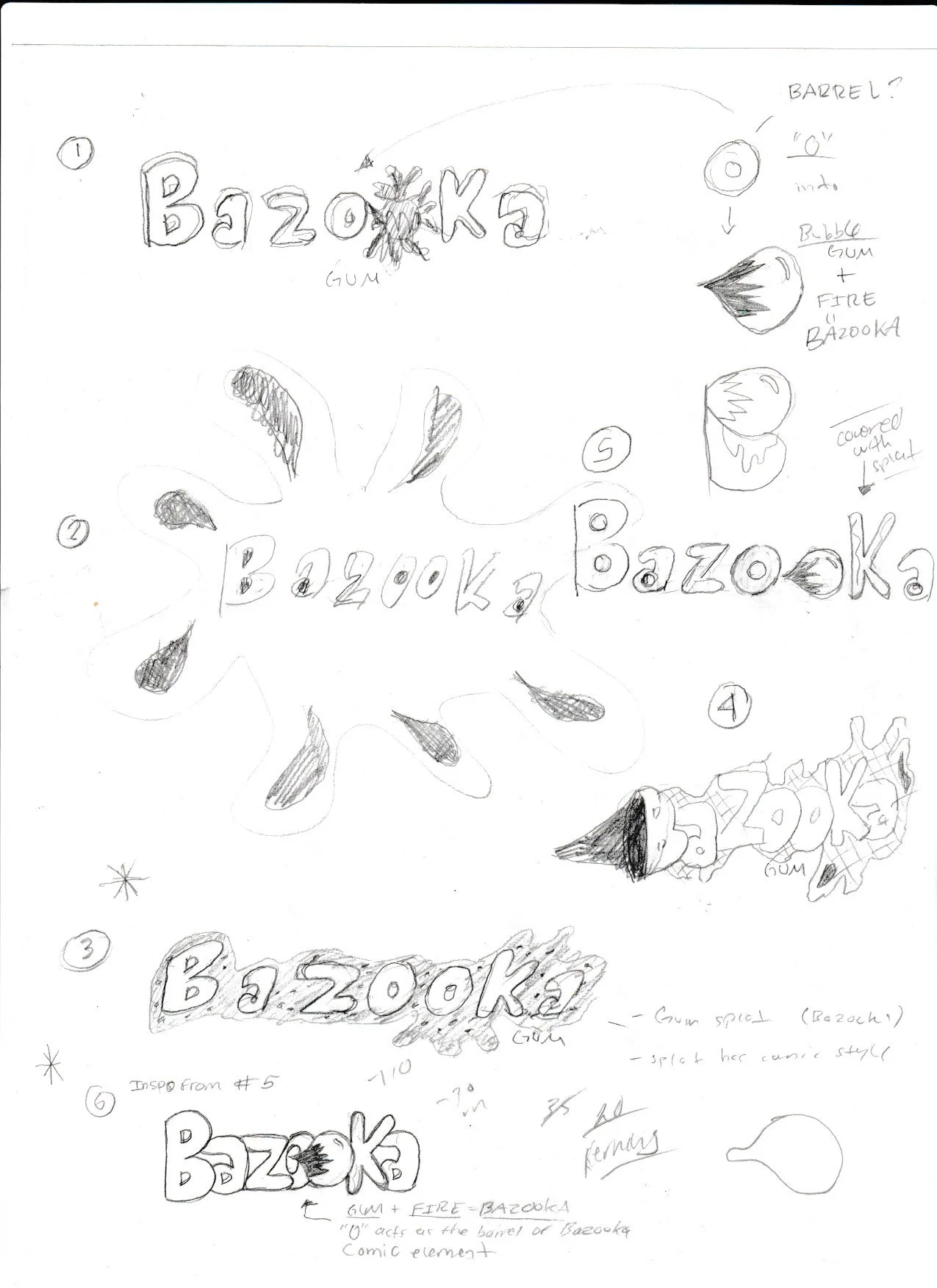
I first sketched out new logo ideas and went with the logo design that communicates they are a gum brand, sticks to their comic background, and also plays beautifully with the typography. While I was sketching ideas, I figured I could make the letter O a bubble gum shape, but also symbolizing the blast of a bazooka, which plays on the brand’s name. I pushed the O closer to the other O because it acts as the barrel of the bazooka, which ties it back to the playfulness of the name.
Process - Packaging Ideas
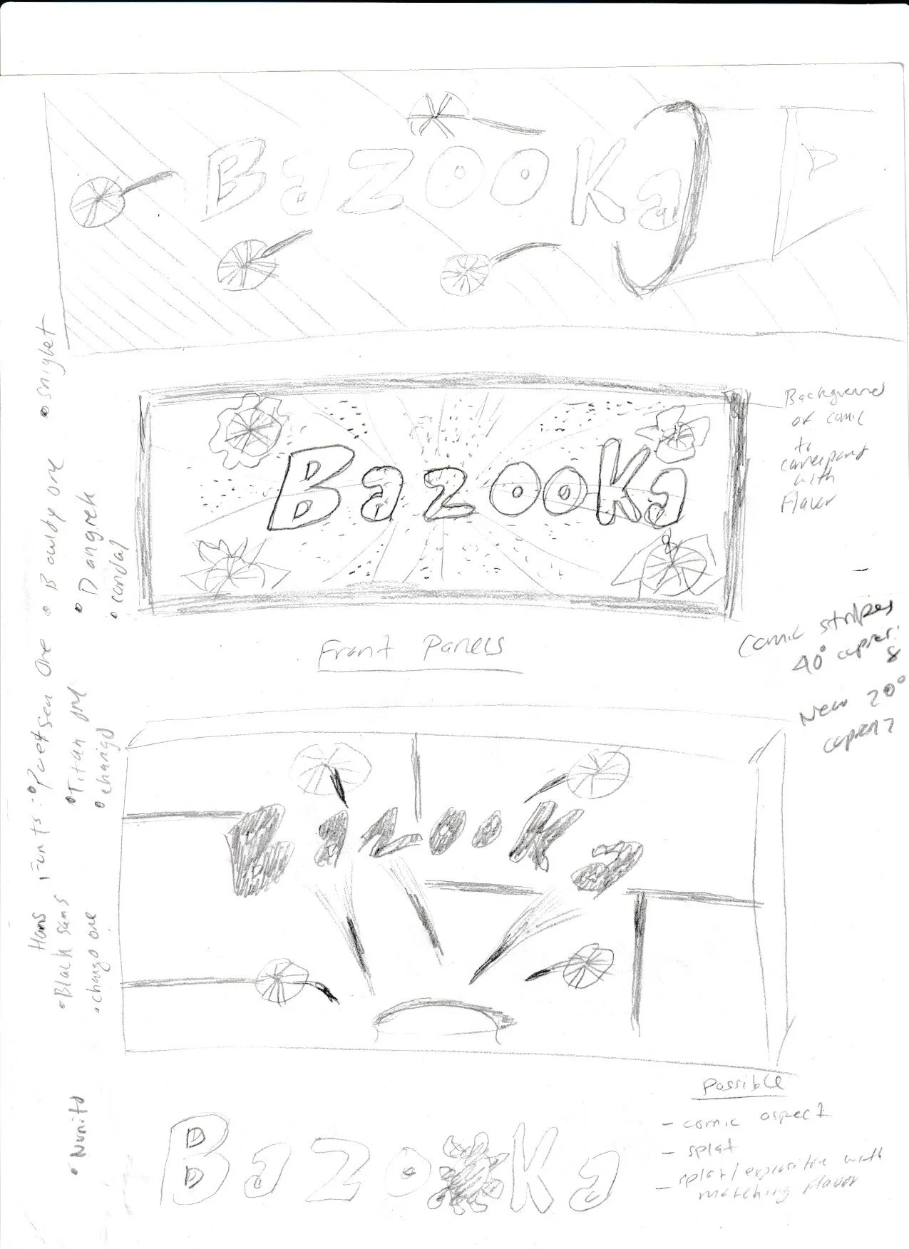
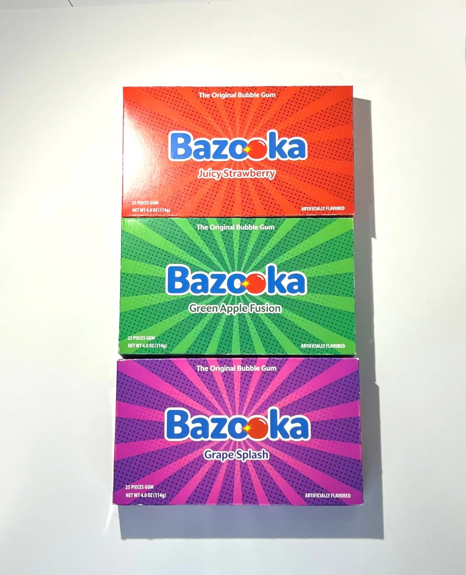
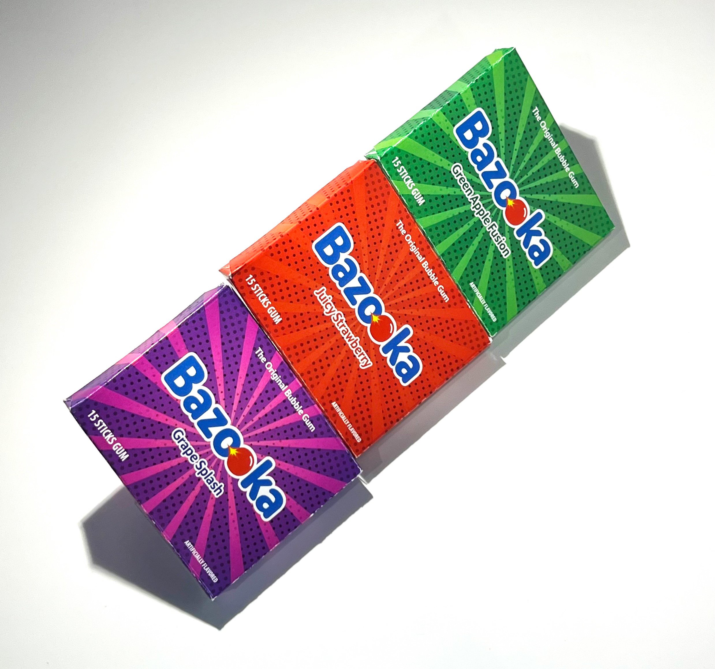
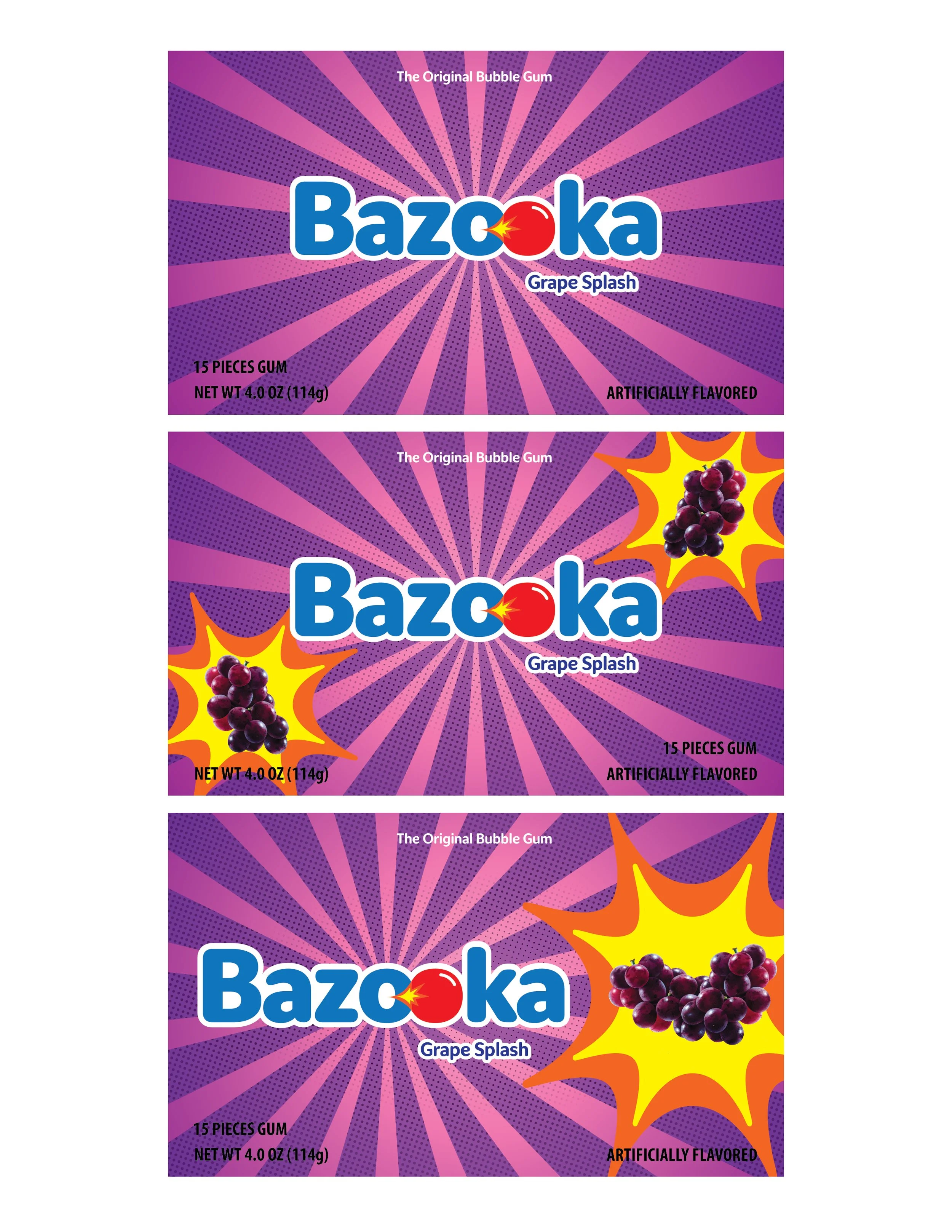
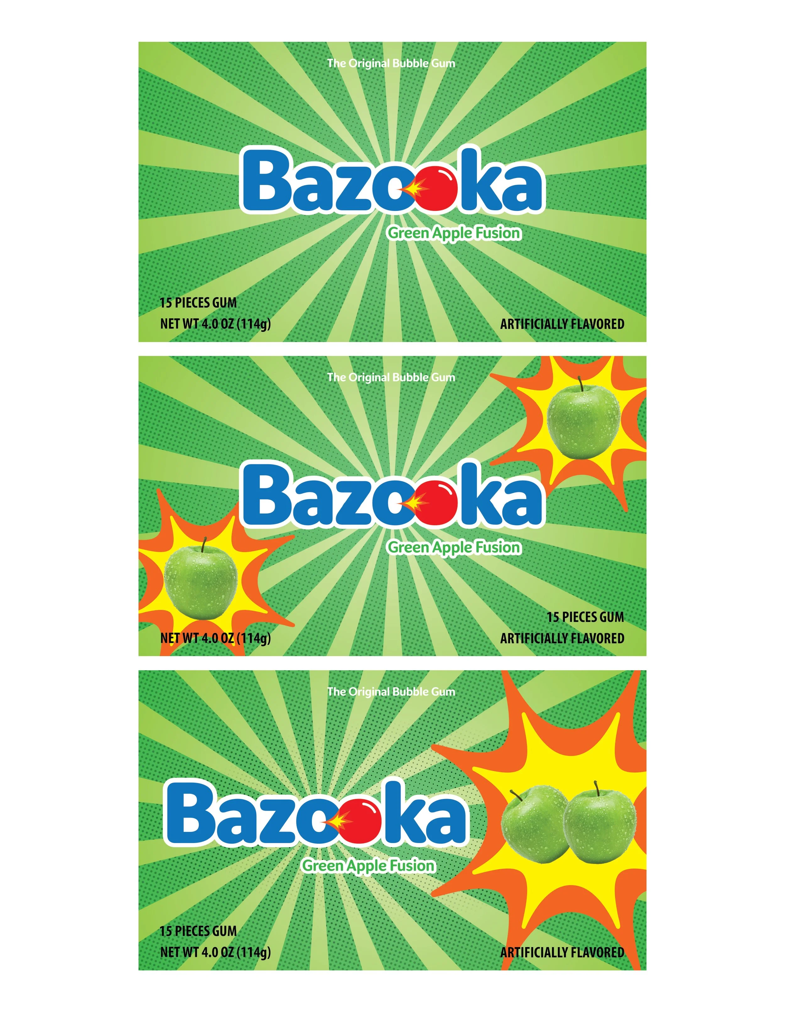
The name not only influenced me, but also the brands history with comics. They also have a line of short comics called Bazooka Joe Comics. Whenever I think of the comics, I think about the stripped comic style background whenever a sound affect is read like “BOOM,” or “BAM,” so I wanted to capture that comic feel for the background. I ended up choosing the second design since it relates back to the brands history with comics.
Process - Draft: Logo
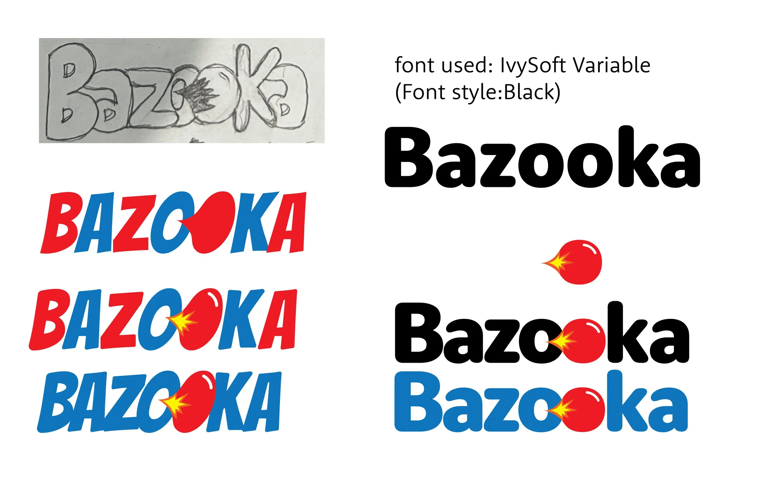
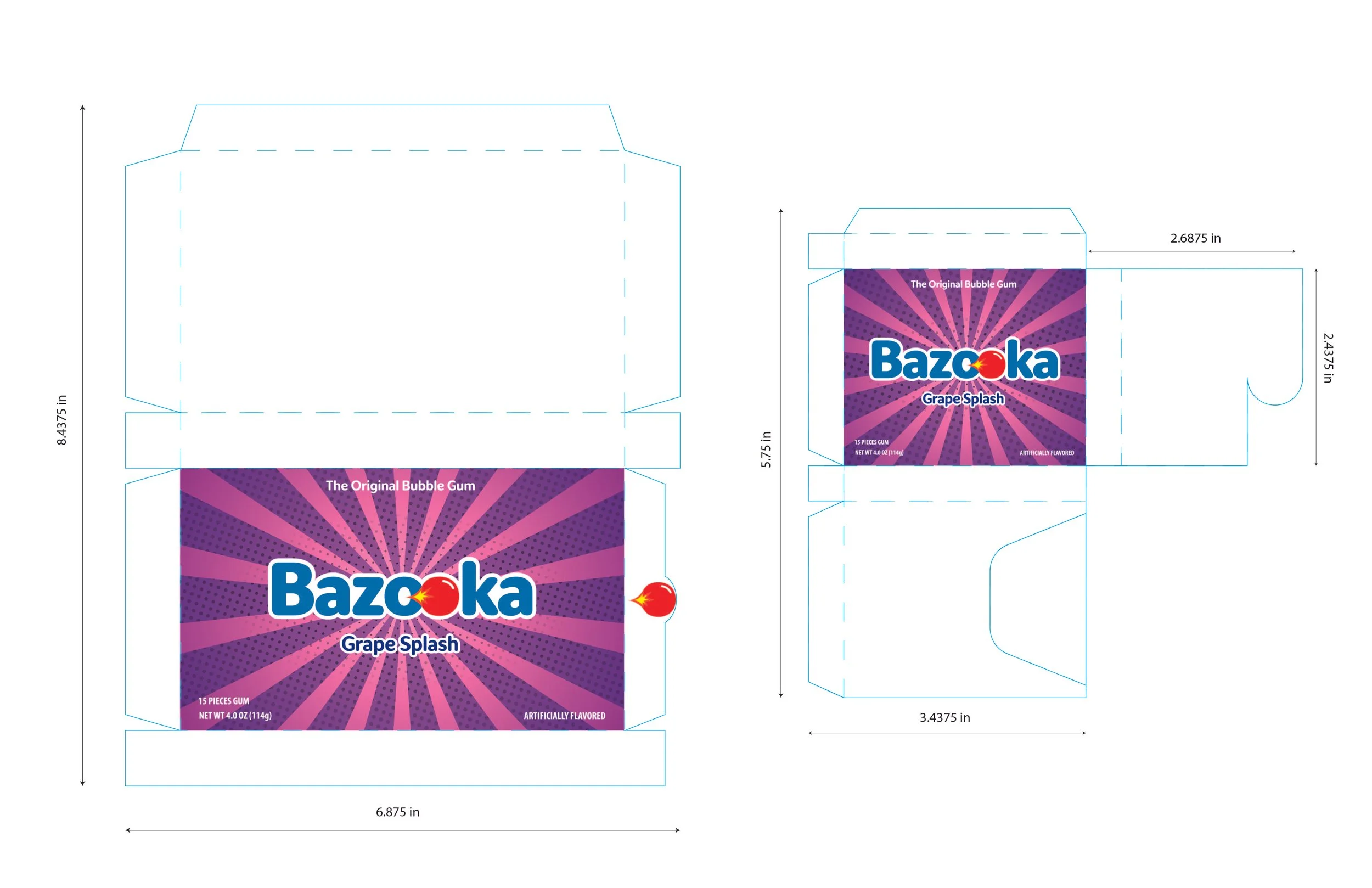
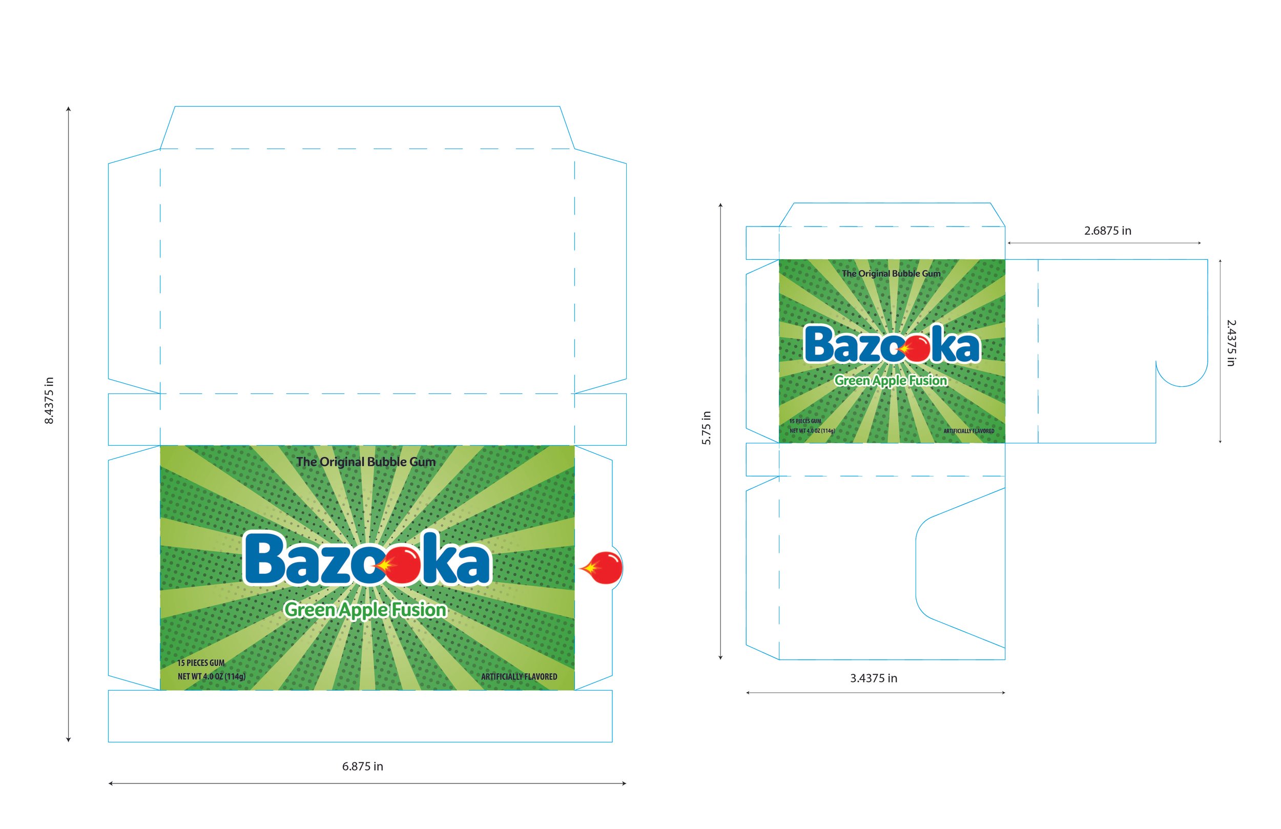
I picked the best logo sketch, and decided to digitize it. Like I mentioned, this logo sketch ties back to the playfulness of the name. I stuck with the original colors of the brand because it worked well with the symbolism and playfulness I was going for, but also to not drastically change the identity of the brand. I wanted the brand to be recognizable, but just with a new style.
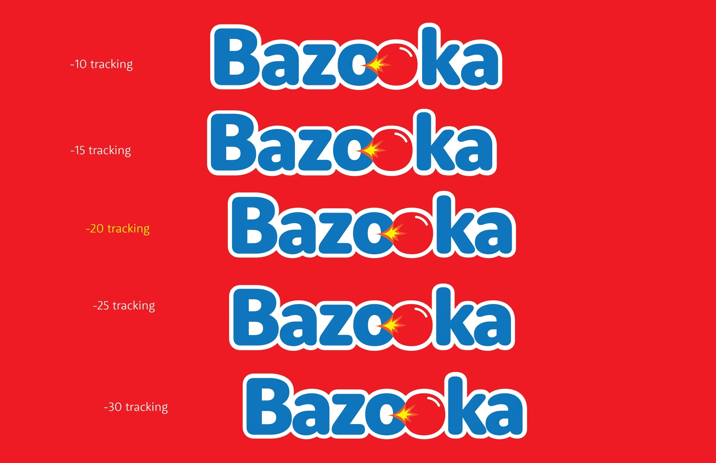
I added a 0.1 in offset path to let the logo stand out from the red background. The offset path was set to white to refer back to the original brand colors. This logo design was new and fresh, and still incorporated the three colors the brand used. After the offset path, I played with the tracking since the two O's were brought together, I wanted the tracking to bring the other letters closer to make the logo more cohesive.
Process - Final Logo Revisions
This new logo uses the same colors used within the origin design to keep the brand recognizable. The logo incorporates the gum aspect within the logo, as if a bubble gum was blasting out of the letter O, keeping it playful to the name.
Before
After
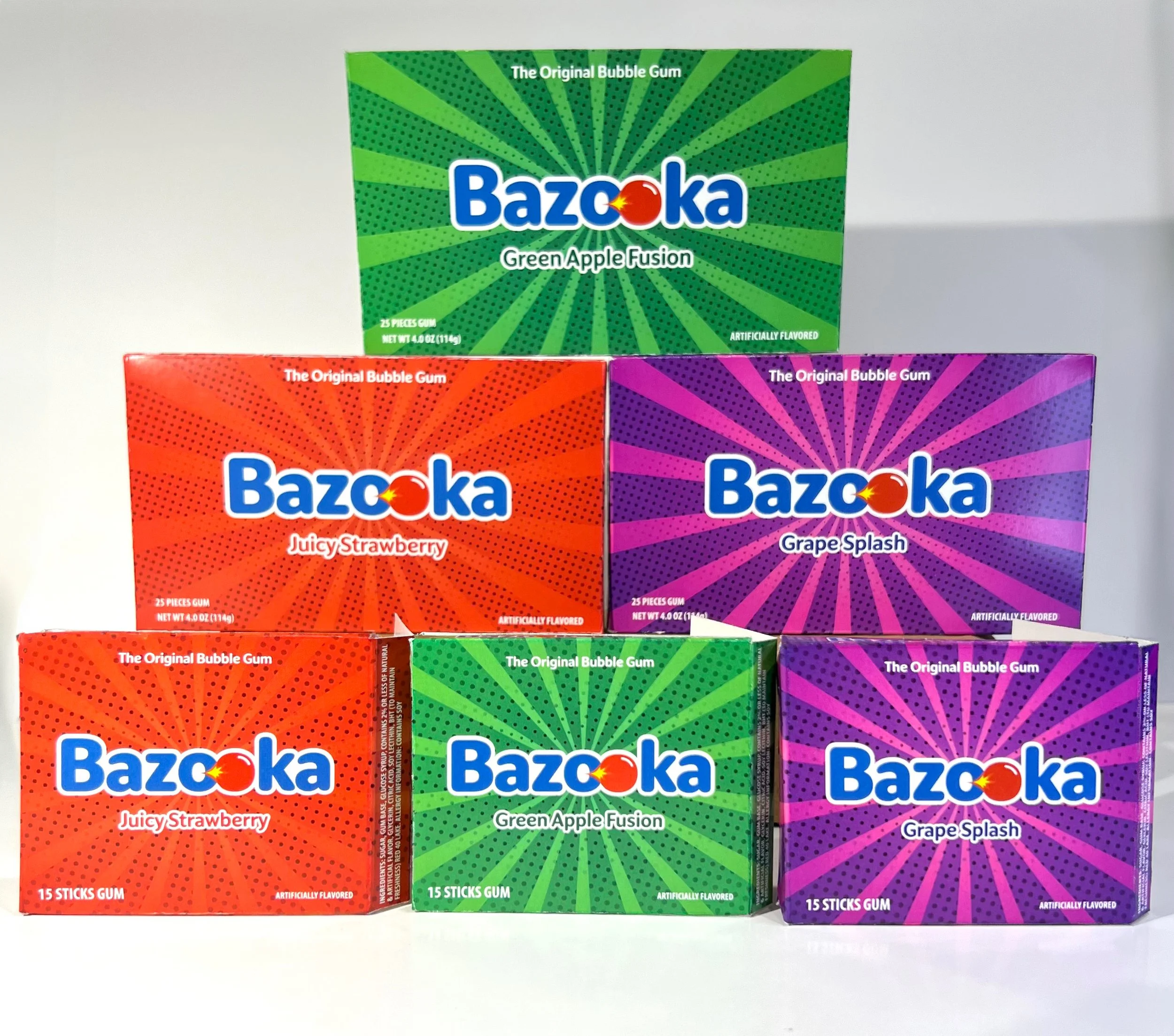
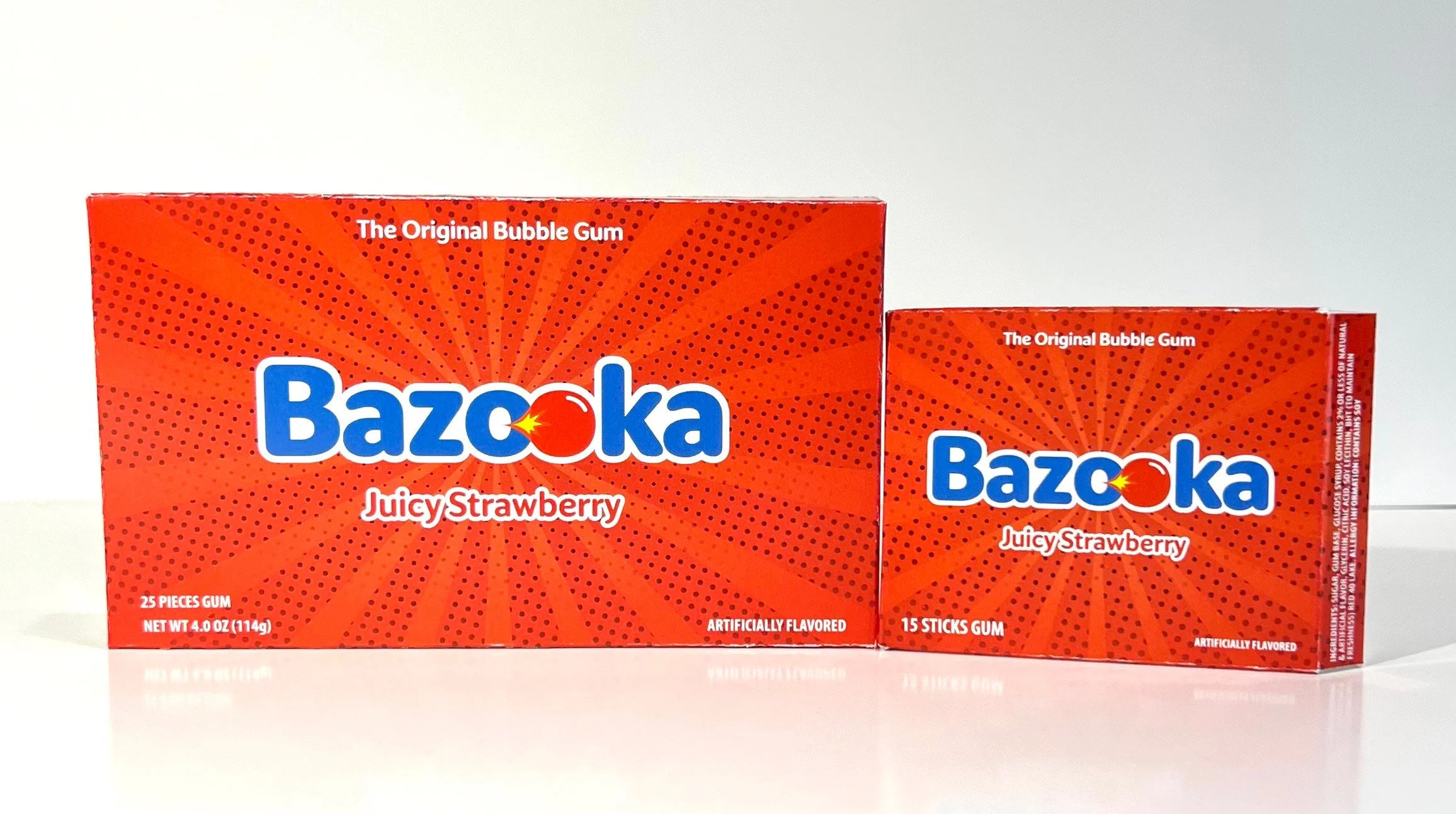
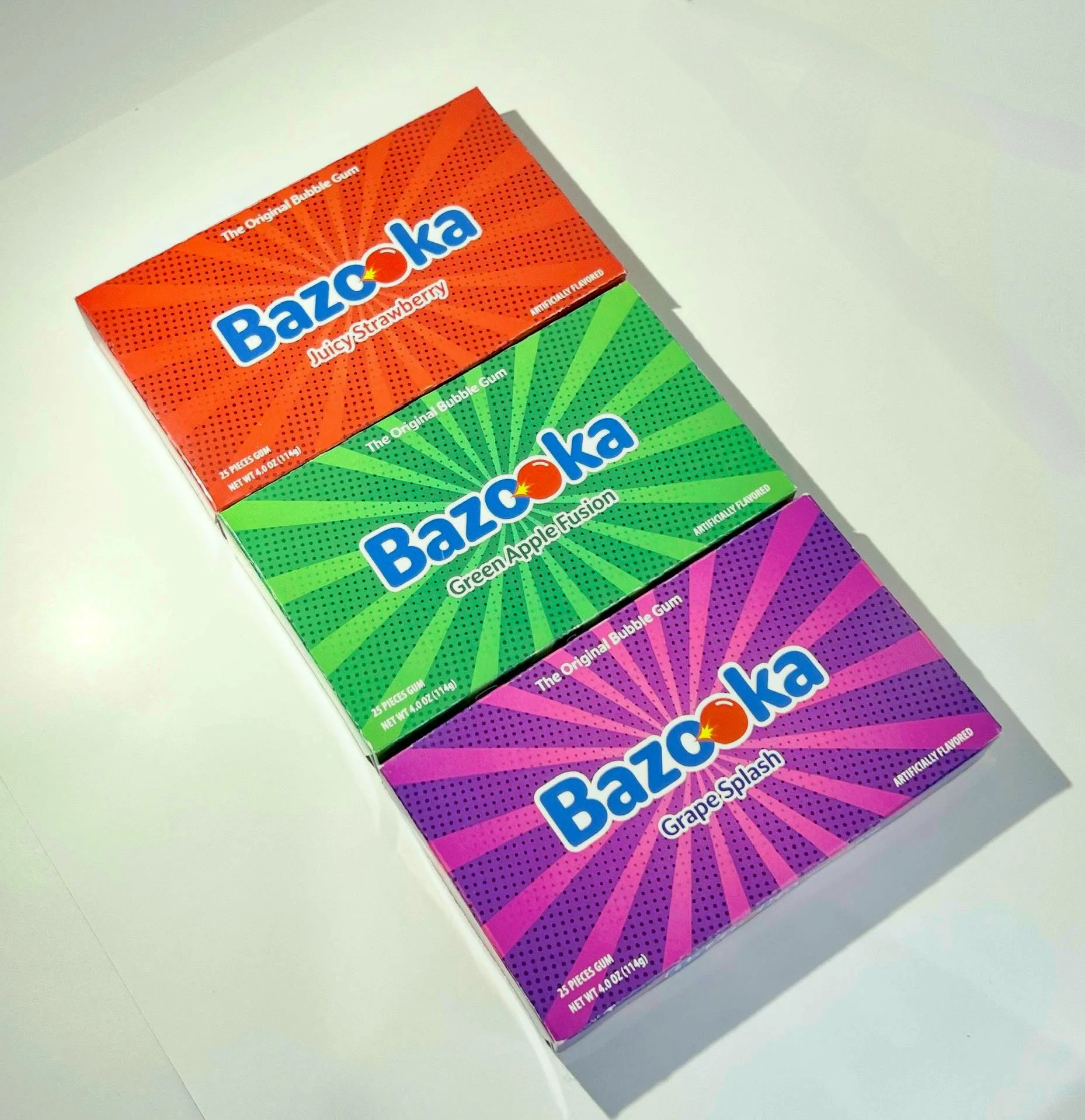
Process - Draft 1: Packaging Design
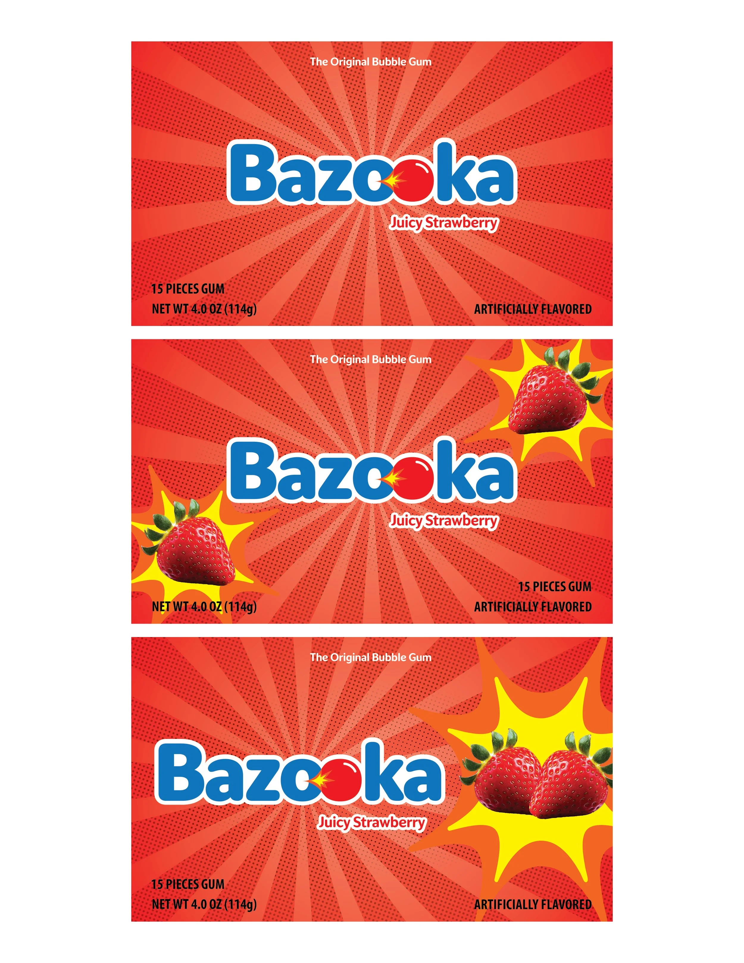
The first design focused purely on the halftone line design often found in comics strips. The halftone lines would be in the background relating back to the brands comic history, while the color red would focus on communicating what the flavor is.
The second design would add onto that, but this time adding actual strawberries to not only communicate the flavor through color, but through images. And the third design would be a variation of the second, placing the strawberry image closer to the center.
The following designs for the grape and apple flavor would follow those concept designs also.
Process - Draft 2: Packaging Design
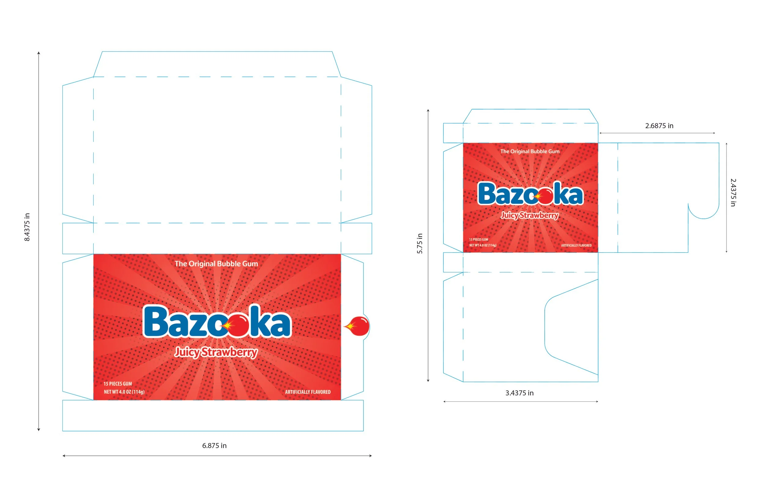
I went with the design of the logo being center of attention with the comic halftone lines in the background. The color and text is able to communicate the product flavor properly without cluttering the front panel with other images.
Process - Final Packaging Revisons
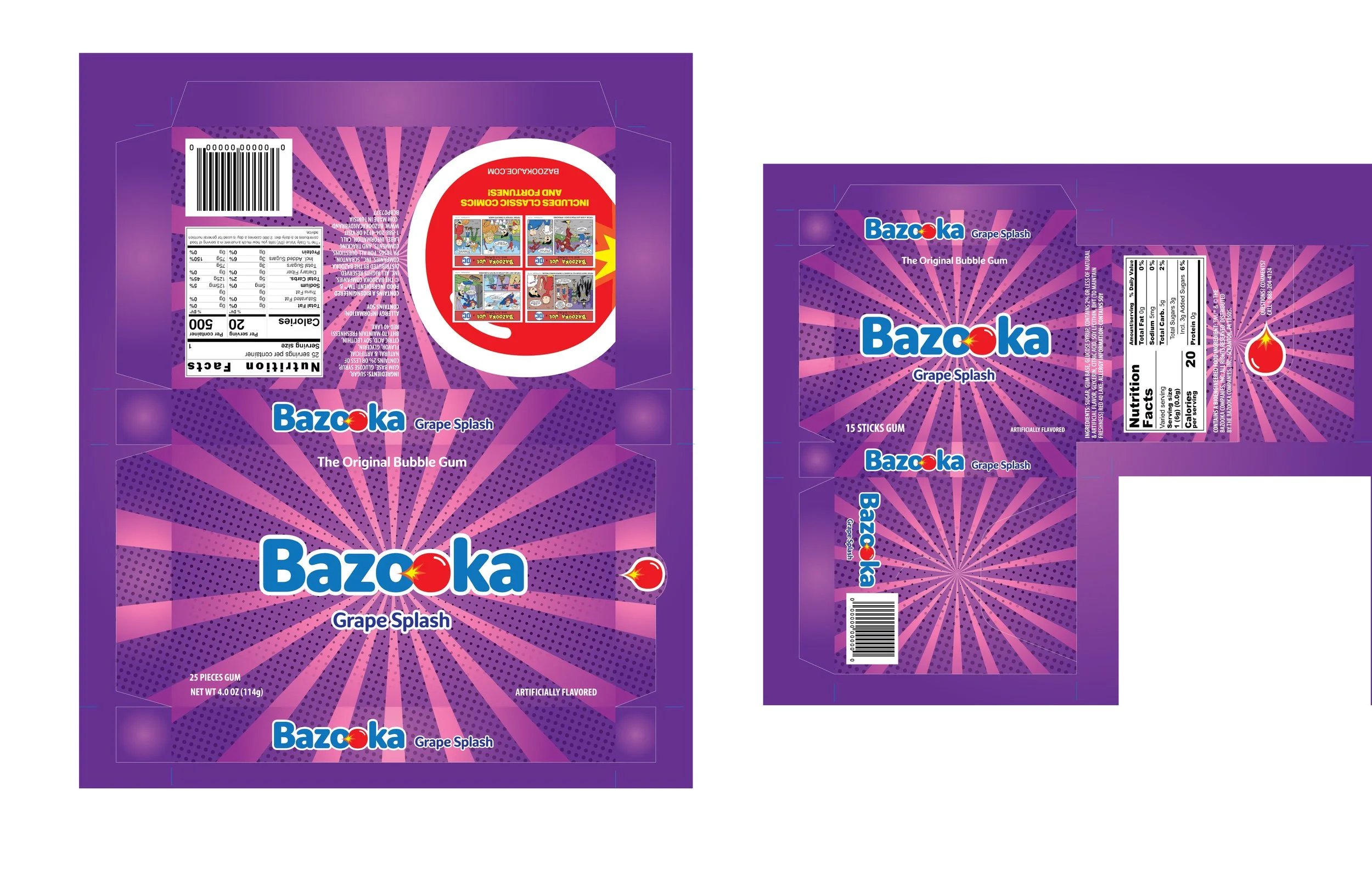

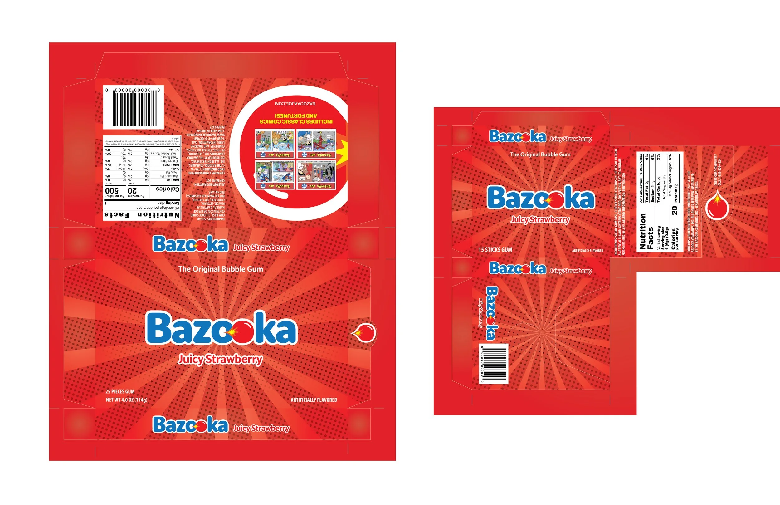
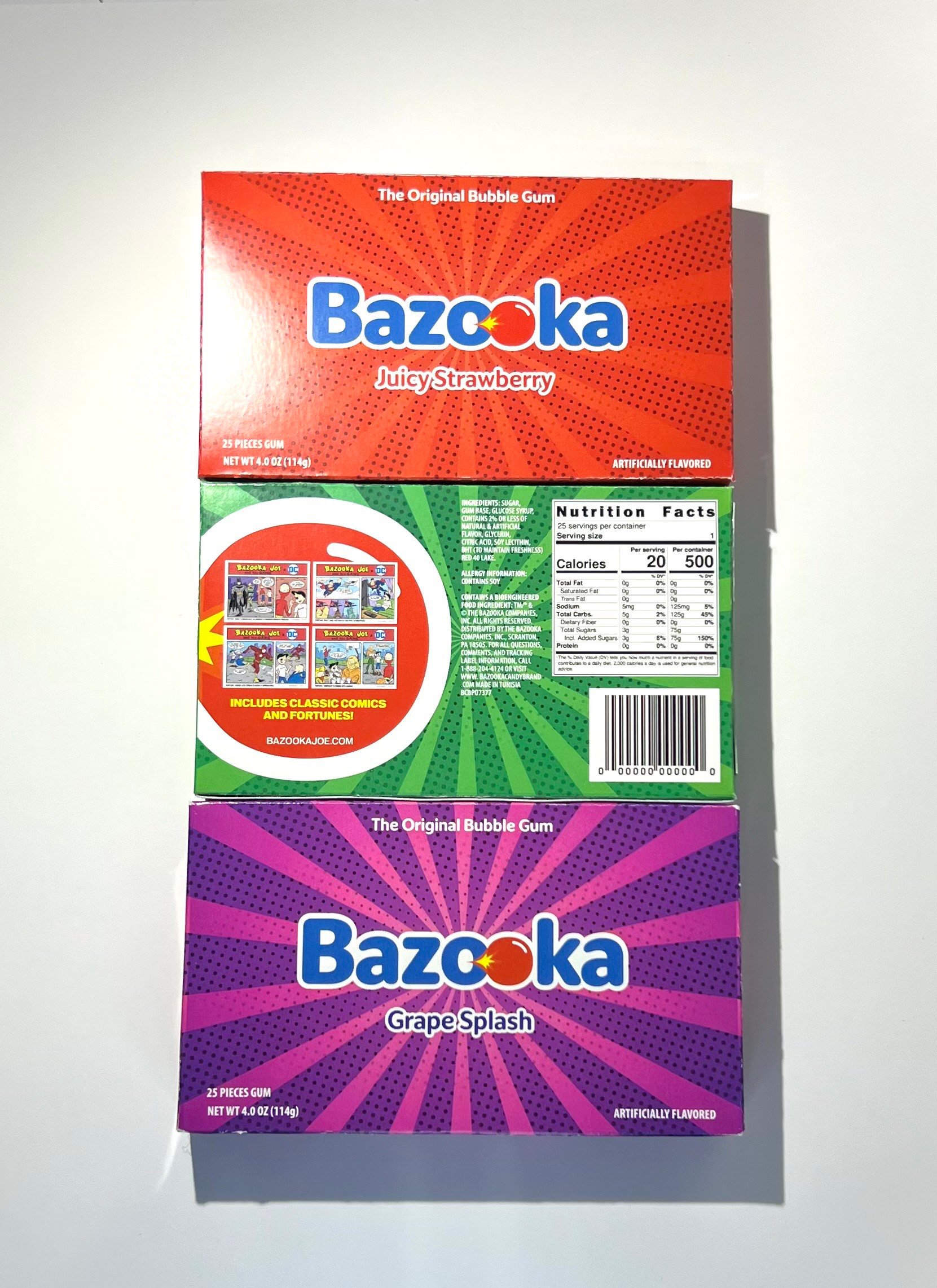
Logo with flavor is located in the front and side panels so no matter how its displayed, the brand is visible. Brand elements like the bubble gum is located on the flap that you can use to open the box, but also in the back panel that showcases the small comics that come with the gum pack (staying true to the brand including the comics in the pack). And important information like the nutrition label, ingredients, and gum size.
Before
After